VENTING MACHINE
speech recognition | web | creative coding | installation
Venting Machine is a web-based experience
that uses speech recognition to convert the user's spoken words,
and convert them into a song
CHALLENGE
Create an interactive installation that uses speech and creative coding to make electronic music.
ROLE : Creator, Developer
TOOLS : Javascript, Processing, p5.js, Google Speech Recognition
SHOWCASE : Maker Faire 2017, ITP Spring Show 2017
INTRODUCTION
Venting Machine is a different and weird take on audio transcription software.
The idea is to convert the process of catharsis into a voice recognition based system.
The experience isn't meant to only transcribe the user's frustrations, but to convert their words into a song at the end.
You input something and you get something.
Hence, Venting Machine.
STRUCTURE
The user starts with a landing screen. Once ready, they can initiate the transcription.
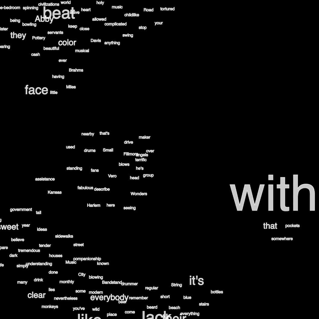
Transcription is accompanied by a word cloud, a live transcript and subtitles.
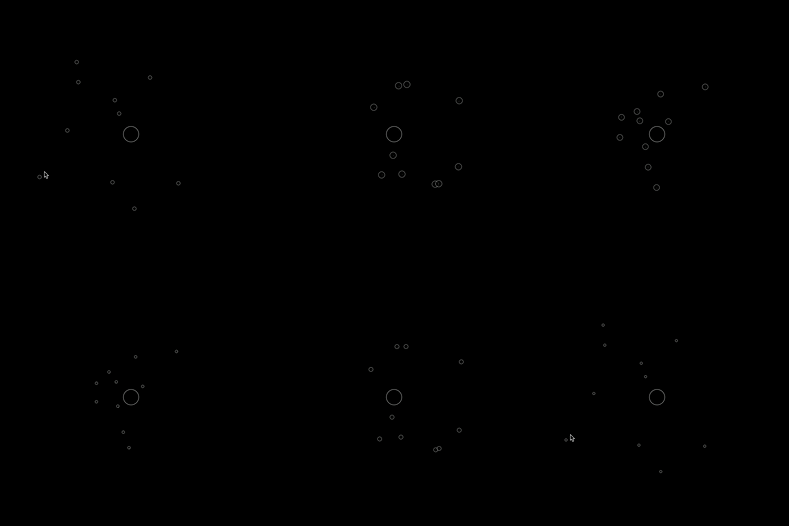
The user has the autonomy to toggle between the word cloud and input-sensitive visualizations using key presses.
Why visualizations? Makes the experience more playful and easier to engage with. Also, funky visuals are cool. They, just are.
The transcription is followed by a submit button, which then leads to a screen with the generated song playing in the background.
DESIGN PROCESS
The experience was designed keeping two things in mind : user engagement and simplicity in complexity.
For user engagement, the user was given the freedom to choose visuals of their liking. They also had the ability to modulate the music that played with the consequent song.
For simplicity, there were no menus. Just key presses that added or removed functions from the experience.
The entire experience was based in black and white.
USER TESTS AND SHOWCASE
User tests were helpful in understanding how the interface might have been confusing, and instructions were necessary.
The tests also led me to make the experience personal, and absurd.


